Good maps require more
than just displaying your data, add a legend, a scale bar and the “obligatory”
north arrow. If you want to “hook” your audience and tell your “location based story”
in an intuitive way, there is a lot to consider: The nature of the phenomenon
you are portraying, the application context, the target audience or the chosen
technology are only a few of the multitude of variables to take care of.
The latest
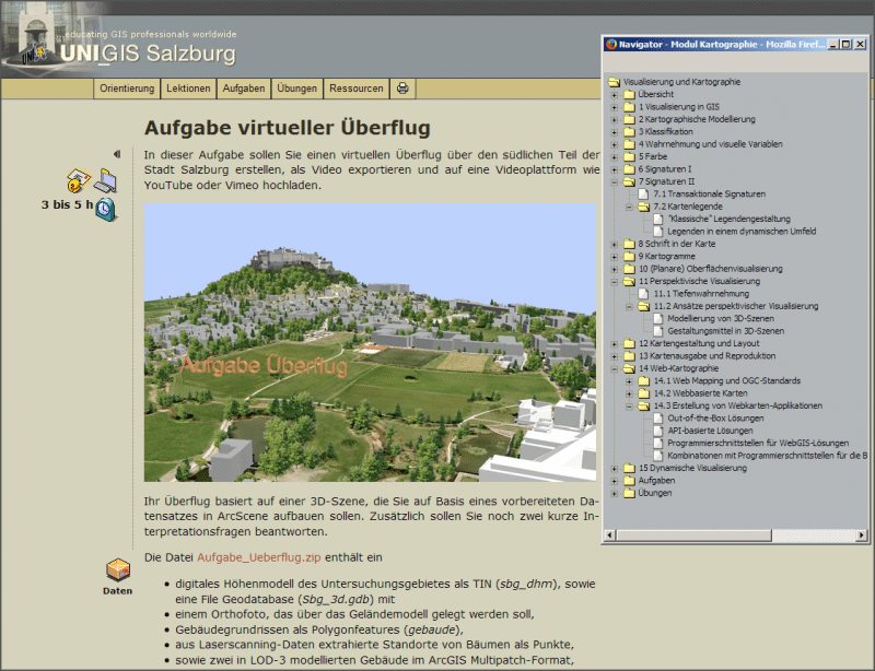
release of the UNIGIS Module on Cartography and Visualization provides essential
information on how to transform your data into appealing, yet effective maps “that
work”. 15 completely reworked and richly illustrated lessons take you all along
the journey of contemporary, applied visualization of geographic data – from basics like generalization, classification,
visual variables and symbol development to the most recent web mapping
technologies, maps as web-interfaces, 3D-visualizations and dynamic representations of space-time data.
More than 30 exercises plus four individualized assignments ensure understanding
of the concepts and its applicability in everyday mapping contexts. “We put a
lot of effort into this huge long-term project, but our intensive work finally paid
off” says Martin Loidl, co-author of the module. “Although our students will
profit foremost, we generated several new ideas by ‘digging deep’ within the
authoring process. A bunch of scientific publications in this area were nice by-products
to the planned outcome.” he added. The (German language) UNIGIS professional intake
from Oktober 2013 will be the first group to start with the new release. A translation
to English is scheduled to be available by May as well.


